Welcome to my blog! Here you'll find many samples of my finished art, conceptual work, unpublished material, and other miscellaneous jobs. You can find a complete list of my published books at this link.

I currently have signed copies of THE GREAT MONTEFIACO, WHACKO THE CHOOK, THE PUMPKIN EATER FROM PONDICHERRY, and THE SHIKKER COLA COWS available for purchase. For more info, please contact me at whackothechook@internode.on.net


Friday, July 30, 2010

Duoshade

I've always loved the look of old comics and strip cartoons. There's an oddly endearing quality to the limited palettes and dot patterns. I find them more appealing and far superior to the needlessly showy, air-brushed photoshop colouring prevalent in comics today. One cool aspect of black and white cartoons was duoshade and letratone, which were popular with cartoonists of old. I'm not an expert on it, as I never had a chance to experiment with it, and to my knowledge they no longer manufacture it, but I'll explain it as best I know. Basically, Duoshade is a special paper/board that has invisible criss-crossing lines (or dot patterns, textures, etc etc). Once inking is finished, the artist uses a developing fluid and paints onto the surface where shading is required, exposing the first set of lines. Then using a different developing fluid the artist paints where they want darker areas by exposing the crossing lines. Artists like Jack Davis and Wally Wood, and countless others used it to great effect in very early Mad. I really love the somewhat nostalgic look of it, so I've tried to mimic the process in photoshop. Here was my first experiment with it:

And a simple dot pattern...

Simply, I have several layers — The top layer is just the black line work, the next layer is a layer of white, then under that is a layer of dots or lines. Using the wacom I scribbled away at the white layer with the eraser to expose the pattern. Simple. The duoshade requires extra layers, but it's not hard to figure out. Some more experiments:

With the next couple of paperbacks I did incidentals for I put this technique to use...

I'll do a post about The Monkey Pirates soon...

Monday, July 26, 2010

T-REX'S TERRIBLE TOOTH


The original title to this book was 'T-Rex Teatime'. It was later changed to 'T-Rex's Terrible Tooth'. Personally I don't find it quite rolls off the tongue as easily as the first, but hey.

I was always looking forward to the day I'd be offered a dinosaur book to illustrate. As a child I was a dino-nut. I could name so many different kinds of dinosaurs, my walls were covered in dinosaur posters, I had books and books on them, I owned dinosaur toys. I often dreamed about them, even hallucinated them a few times. Living in Brisbane my whole life, I used to thrill at driving past the old museum at Bowen Hills and seeing the huge T-Rex and Triceratops sculptures out in the open (they have since been moved to cold concrete boxes that is the 'new' museum). My obsession wasn't limited to dinosaurs though, I liked any giant hulking monsters — Godzilla, Kong, dragons,
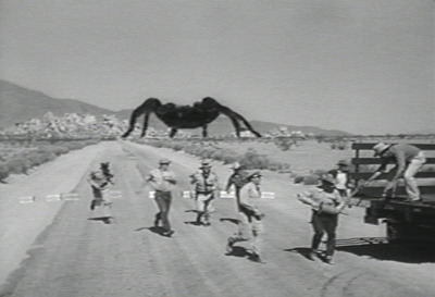
 giant insects, Harryhausen's many monstrous creations, etc. But dinosaurs were extra special, because they actually existed at one point. Naturally I drew dinosaurs frequently growing up. I've never entirely grown out of them, I still have a soft spot for giant monsters. I've wanted to write my own dino book, but have never thought up a worthy story, yet... So when I was offered this one by Koala Books, written by Kathryn England, I said yes immediately. Though at first when reading the text I worried the story was just a bit of vegetarian spin, but it was the ending that really sold it for me — the timeless message about a leopard not changing it's spots. This ending was devious, which I liked, and I'm impressed they went with this option...

The main character underwent a few revisions...

Until we settled on this design:

I loosely based this design on my dog "Foo", who also has a bulky head and an underbite. He also has an insatiable appetite!

Once the roughs were finished, I moved onto the finished art. Here's where I hit a slight snag. This being there next book I did after The Pumpkin Eater From Pondicherry, and having enjoyed the process of making that book, I intended employing the same approach to those illustrations to these ones...

I submitted the following coloured samples to the publisher:


It turned out the publisher were wanting illustrations reminiscent of those in 'Who Flung Dung?' and 'Cheeky Charlie', which they had published the Australian editions for, and felt I was doing a different style to those. With a degree of reluctance, I replenished my dried up acrylic inks and pulled my previous method out of semi-retirement...

My basic palette for these was to make the carnivores warmer and 'meaty' in colour, and the herbivores cooler and 'fruity', and their dwellings would be similar. So for the central T-Rex character I mixed a colour like that of dried blood:

I made his home in a volcanic landscape, with lots of muted greyish 'sooty' colours...

Whilst the herbivores homes are lush and green, with a lot more bright colour...

And somewhere in between is a vast desert separating the two regions. The herbivores here are a mix of warmish and coolish colours...

I went crazy with rock textures in this book, again using sea sponge. I'm fascinated by rocks in real life, especially granite, as I spent many winter holidays as a child in the granite belt region. Anyone who is familiar with Girraween National Park might notice the granite arch I slipped into the background here...

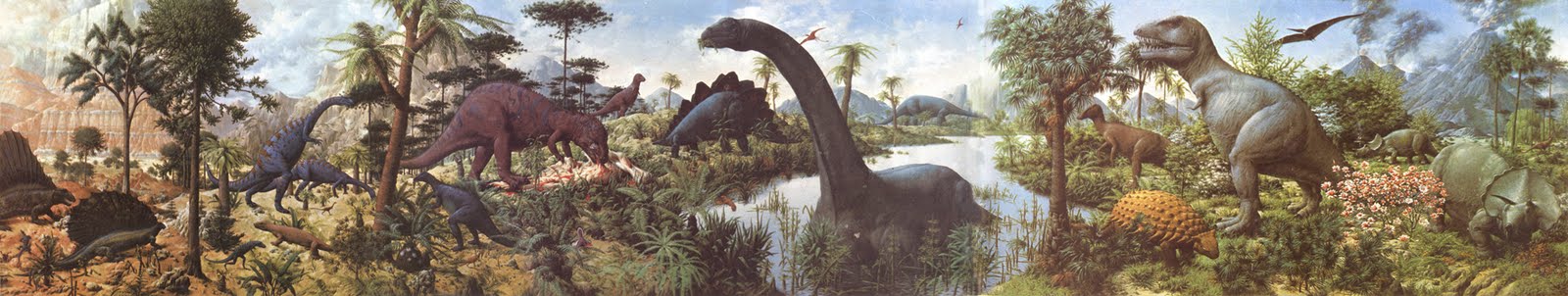
I can still remember one of my very first exposures to dinosaurs, the one thing that may have sparked my interest as a child. It was this painting, 'The Age Of Reptiles':

This is a giant mural by Rudolph F. Zallinger at the Peabody Museum at Yale, and I first saw it in an old wildlife book of my father's — it stretched for three pages. I used to study this picture for ages, I was completely absorbed into this world. I speculated on where each dinosaur was coming from and where they were going, who would eat who and working out escape routes for herbivores, and relishing the gore that lay underneath the Allosaur! It never occurred to me that this painting represented the different periods in prehistory expanding millions of years, I just took it literally and saw it all happening at once, in the one location. This shaped my childhood image of dinosaurs — I thought groups of dinosaurs of all variety used to spend their time congregating on the same field, grazing and fighting, and doing all sorts of crazy stuff!

There is no hardback version of this book to my knowledge, only paperback. If there was going to be a hardback version, I supplied these endpapers in case:

I don't like wastage, so I know I'll find a use for these somewhere down the track, if I happen to do another dinosaur-related book. I hope so...

T-REX'S TERRIBLE TOOTH was released this year in Australia, and available at all good book stores.

Thursday, July 22, 2010

TORTOISE v HARE: Part 2


As I mentioned, I watched a lot of cartoons at the time of working on this project. The Tortoise and Hare story was a popular fable for parody in cartoons, notably Avery's 'Tortoise Beats Hare' and Clampett's 'Tortoise Wins By A Hare'. I saw this as my small homage to those cartoons, so I took an overtly cartoony approach.

This is the first book I've tried my hand at creating different textures using sea-sponge. All the rock, bark and gravel textures were done this way.

This was a common technique with background artists and a lot of Golden Book artists like Al White and Hawley Pratt.

Like I said I don't like straight blue skies, but I felt it worked here to maintain a cool palette. In retrospect I'd probably lose that pink cloud though, blurgh! There's a lot of primary colour throughout this book, and ordinarily I try to avoid all three primary colours together, but this is in keeping with the text, which states Hare is in red and Tortoise is in blue...

The posters and signs throughout, or anything else that has text on it (like the Hare's and Tortoise's logos) needed to be done in photoshop. Reason being subsequent foreign translations of the book require all text to be changed.
Crowd scenes are difficult and time-consuming, so I try to make them fun. Most of it is planned, but other small silly details are improvised. "Chicken Fat" is what Will Elder called it.

This was one of the more enjoyable books I've done, though it does bring back memories of being stressed planning my wedding last year! I completed this a week before the big day.

Books by Preston:

Tuesday, July 20, 2010

TORTOISE v HARE: Part 1

My first step in illustrating a text is to design characters. Firstly I sift through the text to see if there are any specific descriptions or subtle clues given about what the main character/s looks like. Picture books as a rule aren't big on lengthy physical descriptions, so often I have the freedom to make up anything, so long as it doesn't contradict whatever is written...

My approach to designing characters is pretty much the same as it would be designing them for animation. I construct them in a way that they are not too complex and they have to remain functional, ie. I need to be able to draw them in any position required without too much hard work. I adopt this principle for characters that appear frequently throughout the book, whereas, one-off characters - those who might only appear once or twice - I can afford to elaborate on them far more. A prime example of this is the noticeable contrast between the simplicity of Furley in Who Flung Dung? and the detail of the other animals who appear just once.

My next step is to draw quick storyboards showing loosely what will be happening on each page. Again, the process is not much different to an animated short...

Each step is run past the publisher, or in this case the Art Director/Designer at Meadowside — She and I worked on this closely via email, throwing ideas back and forth, and making compromises. I much prefer a designer to be attached to a project from scratch, as was the case here, but more often than not I design my own books, working out layouts, placement of text, etc (only to forgo a designers credit in the finished book).

The next step, once storyboards and character designs are approved, I move onto roughs. Like the storyboards, suggestions are made, and it's just a matter of fine-tuning everything. Photoshop plays a big part in this stage. I draw everything via hand first, then scan it all in and shift everything around and resize stuff until I'm happy with the over all feel of the layout...

... an initial idea I had for Hare's racing outfit was one like the one Cathy Freeman wore at the 2000 olympics. I used to find her outfit oddly amusing, so I thought this would be a funny reference, and I thought Australian's would get it. Though, the joke was probably lost on the poms, so I changed it to my second idea, which was a reference to comic book hero The Flash. Actually, no, that was my third idea, the second one was flames on his suit, like a hotrod.

The final step to preliminary work is doing up a few colour tests, working out a palette.

This is actually one of the hardest stages I find. I tend to agonise over colour. I really dislike the whole 'trees are brown, leaves are green and skies are blue' approach to colouring, and I avoid the obvious where possible. I don't think I succeed in this area as much as I wish though. I still look back on heaps of my work and wish I'd been more adventurous with colour. I envy artists who have such a natural gift in choosing appealing colours and combinations. I feel I'm getting better at it, but I've still got a long way to go. I find the best source of inspiration in this department is the background art for many Looney Tunes shorts, by artists like Maurice Noble or Hawley Pratt. They are masters of colour. I watched a lot of cartoons when working on this book!

TO BE CONTINUED...